Welcome to our kitchen! It's not like I haven't already shown 5 million pictures of the kitchen in other posts since we moved here two and a half years ago, but I've never done an official post about it.
This is as you walk down the hallway coming from the front part of the house. The dining room is to my left where I'm standing to take this picture. You just can't see it.
The door on the left is the pantry. Straight ahead is our organization center.
As you first walk into the kitchen if you look to the right, this is what you see. I'm planning on staining the rest of the lower cabinets in the next two weeks.
Standing by the kitchen table looking back at the kitchen.
And speaking of the kitchen table, this is it. Elliott gets his own special, toddler sized chair.
Up above the table is a little window. I'd love to leave it uncovered, but unfortunately the afternoon sun shines right on the TV. Not so good for the screen and I just have no desire to completely re-configure the family room to fix the sun-TV problem.
When we moved in there were mini-blinds on the window over the sink, but I wanted to be able to see out in the backyard, so we took them down. The rays of light from this window do not make it to the TV.
The kids are growing grass on the windowsill right now.
The only phone jack in the whole entire kitchen/family room room is right by the sink. I'd like to know what moron planned that one. Our alarm system has to hook into the phone line so it's hanging right here. Also, the wireless router hooks into the phone line so I put it inside of that box. It took me 2 years to find the perfect box for it.
I bought this little Thomas Kinkade painting when I moved into my first apartment when I was 21. I've had it in every single kitchen since then,
Hanging baskets from IKEA. I keep produce in them.
The coffee station.
The laundry room is right next to the kitchen and through the laundry room is the garage.
We have a toy shelf separating the kitchen from the family room.
I keep my purse on one of the bar stools at the island.
And my lunch bag hangs on another bar stool.
Up above the kitchen cabinets. It took me about 6 months of living here to figure out what to hang up there to fill up that space. I used to fret and stress about it. Often.
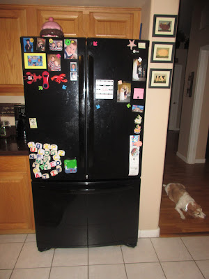
Photo bomber Ginger, again.
I just bought this clock about a month or so ago. Elliott refers to it as Mommy's New Red Clock.
Looking back towards the dining room.
The pantry door again.
I took all of these pictures right after we finished putting the island back together. But the island is never, ever completely empty. Except for the 5 minutes before we have a party.
This is a more realistic view.
And that is that. I'm pretty sure I have shown pictures of the inside of the pantry before, but I think my next tour will be the pantry and the laundry room. Mostly just because the family room is a disaster and will continue being so until the children are quite a bit older. So that tour will be forthcoming in 2020.


5 comments:
Beautiful! I like how open your rooms are but there's still a divider to the other rooms.
Insomnia so catching up on reading...have a number of comments. First I love the rectangle things above your cabinets. They look even better in person and I meant to tell you when I was there last. Next, give Ginger a break if she is laying somewhere and you take a picture it's hardly a photo bomb. Have some doggy compassion. It's not like she should be expected to lay in any one of her 12 doggy beds. Moving on from doggy advocacy. Elliott's chair: it clearly needs to be stained dark so it matches the set and you have the stain. I say you add it to the project when you do the lower cabinets. Lastly...you know I bet your dad could add another phone jack somewhere helpful! He can do just about anything...I think you should make him do it!
I know we have seen pictures of the kitchen in use before, but there is still nothing like an official tour to get a true idea of the space. It is especially helpful for those of us who have not seen it personally. I love that organization center. I really need a space like that! I love how big and spacious your kitchen looks with lots of cabinets and counters for work space. I don't think I have ever lived in a house with an abundance of cabinets or countertops. One day...sigh! I also like the high ceilings and the way you utilized the higher areas for decorations. It is very pleasing to the eye as you look up. I can't wait to see how the rest of the cabinets look stained. I know you are planning to do the rest of the lowers the same dark color. What about the top ones? I love all your little signs around the kitchen too. I can tell this is your favorite room in the house. :-)
This is what I get for commenting 2 weeks after everyone else. They all "stole" my comments! I completely agree that Elliott's chair needs to be stained to matched. ;) Seeing your kitchen makes me miss coming over to visit and hang out. Yes, I only did it a couple of times, but this post makes me what to do it again.
Very nice! I will pay extra close attention to all these details next time I am in your kitchen. :)
Post a Comment